
SpendMend Mini-Marketing Video Project
Situation
Where & When:
This Project took place during my Marketing Internship at SpendMend from June 2025 to August 2025.
Context:
SpendMend was undergoing a rebranding initiative and sought to strengthen its digital presence through short, informative video content. The goal was to help hospitals better understand Spendmend’s services and solutions through clear, visually engaging storytelling
Environment:
This was an independent project assigned directly to me by the Head of Marketing, allowing me to take full ownership of both the creative and technical aspects of the work.
Team Members:
- Role: Marketing Intern
- Additional Team Members: None (I worked individually, collaborating only for feedback and final approvals)
Task
Assignment Overview:
I was asked to create four short animated videos that showcased key company features to hospital clients. Each video needed to be:
- Visually engaging
- Consistent with SpendMend’s updated brand identity
- Simple and easy to understand
Key Responsibilities:
- Utilize the provided scripts to design and animate supporting visuals
- Create cohesive, branded motion graphics using Adobe Express
- Ensure all visuals are aligned with the company’s rebranding goals
- Prepare the videos for posting on SpendMend’s social media platforms as short, informational segments
Direction & Oversight:
The project was requested and supervised by the Head of Marketing, who provided:
- Initial creative direction
- Feedback at key stages
- Final approval before publication
Action
Planning:
To start, I:
- Reviewed the provided scripts and references
- Met with the Head of Marketing to clarify:
- The messaging goals
- The tone and target audience
- The visual direction for the rebrand
These discussions established how animation could visually reinforce the company’s identity and communicate ideas effectively.
Initial Design & Storyboarding:
I developed simple storyboards and visual concepts to define:
- The pacing and flow of each video
- The use of consistent color palettes, typography, and iconography aligned with the new brand identity
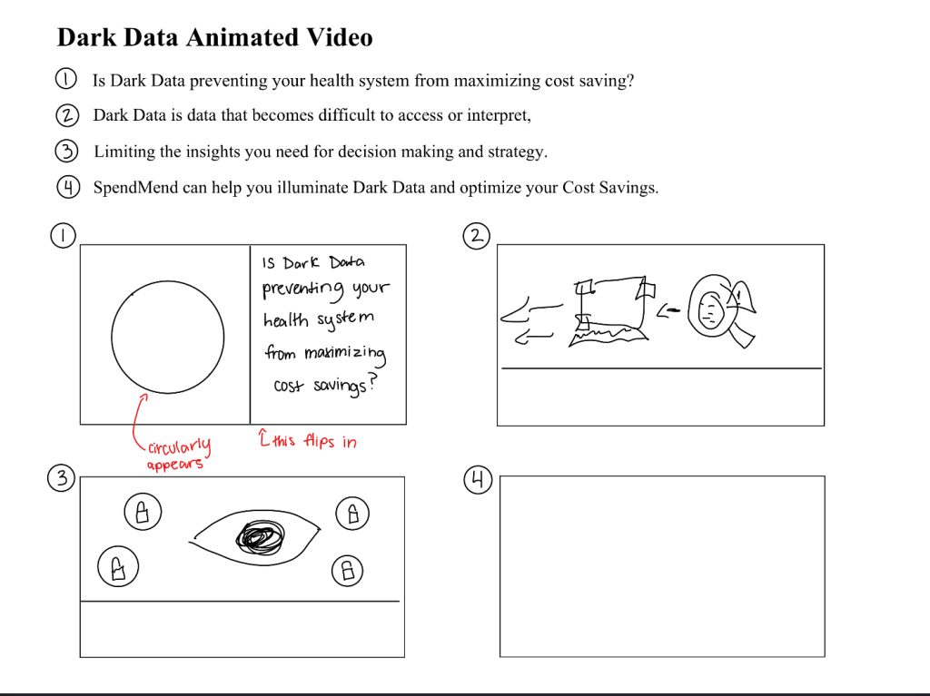
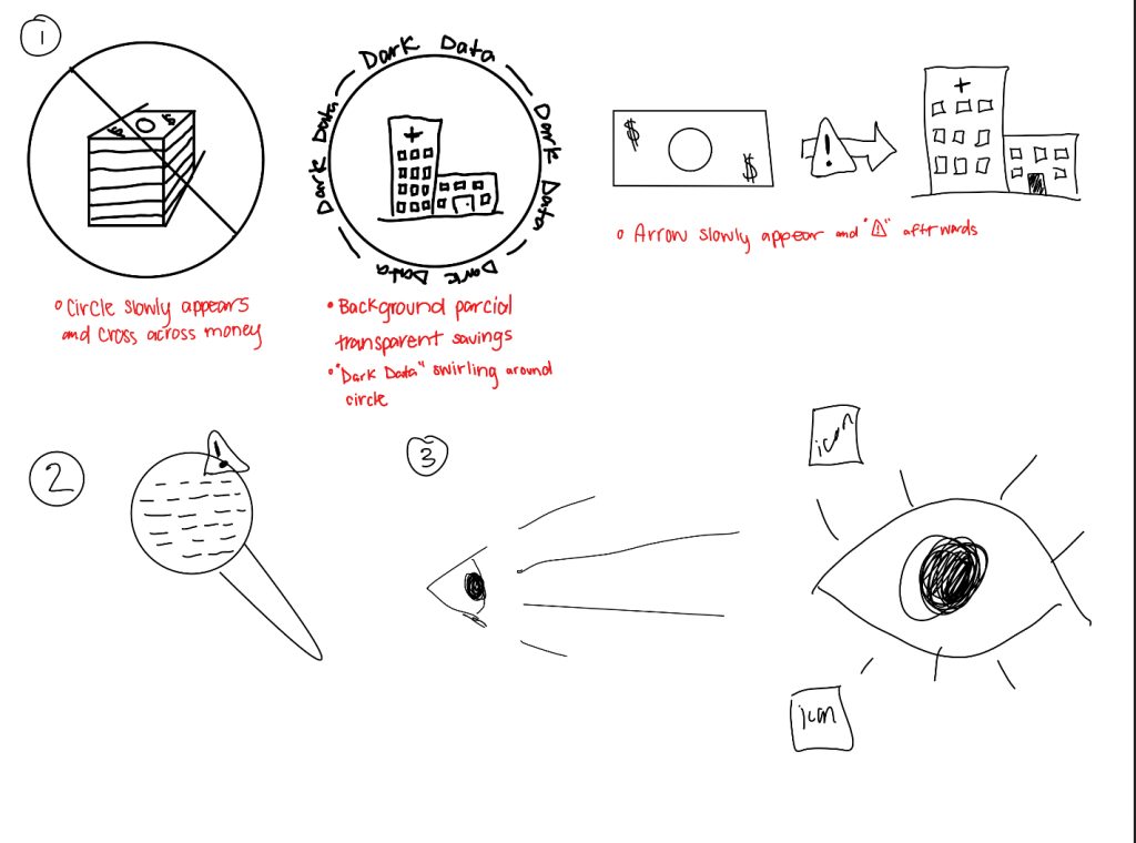
Once the initial designs were complete, I transitioned my work to Adobe Express for refinement and internal feedback. After review sessions with my team, I adjusted my approach to:
- Better match the brand’s image
- Create a simpler, more replicable visual system for use across all videos and slides
Visual Layout & Animation:
Before Feedback
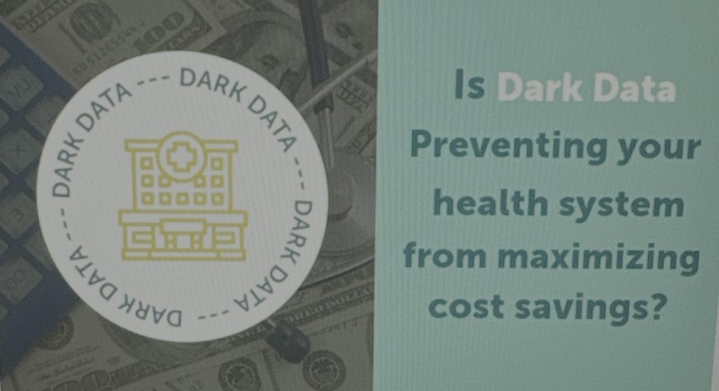
After Feedback
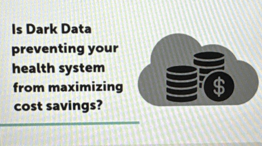
Each video slide followed a clean, structured layout:
- Left side: Text content
- Right side: Icons or visuals representing the key idea
- Bottom border: A line in the company’s primary color for visual continuity
I designed two main transition types between slides:
- Slide-down transition
- Slide-across transition
To guide the viewer’s eye, I animated the colored line between transitions for a smooth, connected feel.
Using Adobe Express, I added subtle animated elements that complemented the narration.
Notable details include:
- A custom keyframed “plus sign” animation used as a signature marker of the SpendMend brand
- Individual icon animations on each slide, tailored to match the complexity of the topic
Finalization & Handoff
After assembling all visuals:
- I added SpendMend’s contact information and social media links for audience engagement.
- I conducted a final review to ensure:
- All text was error-free
- Animations played smoothly
- Transitions were consistent
Following a final check with the Head of Marketing and other creatives, I implemented a few minor adjustments before the project went live.
To support future use, I also produced a detailed step-by-step guide explaining:
- How to create and animate new videos
- How to maintain color, typography, and motion consistency across future materials
Result
After final approval from the Head of Marketing, the completed videos were published across SpendMend’s social media platforms, primarily on LinkedIn, where they served as short, informative segments for current and potential hospital clients.
The videos helped visually reinforce SpendMend’s rebranding and provided a clear, engaging way to communicate complex company offerings in a more accessible format.
Key Outcomes:
- The animations were successfully launched and positively received by the marketing team and audience.
- The project established a repeatable visual framework for future company videos, ensuring consistency and efficiency moving forward.
- The deliverables contributed to increased brand cohesion across digital channels.
Personal Takeaways:
Through this experience, I learned:
- Hands-on experience animating within Adobe Express, developing creative problem-solving skills along the way.
- How to adapt my work to reflect critics and the importance of brand consistency.
- That with larger brands, simplicity often delivers the strongest impact.